Industry

Non-Profit

Project

Brand Identity for the Charity Foundation

Nezabutni

Creating a Warm Identity for a Foundation

Nezabutni needed a visual identity for a Ukrainian charity foundation supporting people living with dementia. The identity had to feel serious and trustworthy, while making a difficult topic more approachable for families, caregivers, donors, and the wider public. We built the logo around the forget-me-not flower — an international symbol of dementia awareness — and developed a softer visual system using purple, pink, yellow, gentle gradients, and rounded typography. The heart was incorporated into the logo’s structure without becoming the main symbol, helping the identity feel caring without becoming too literal.

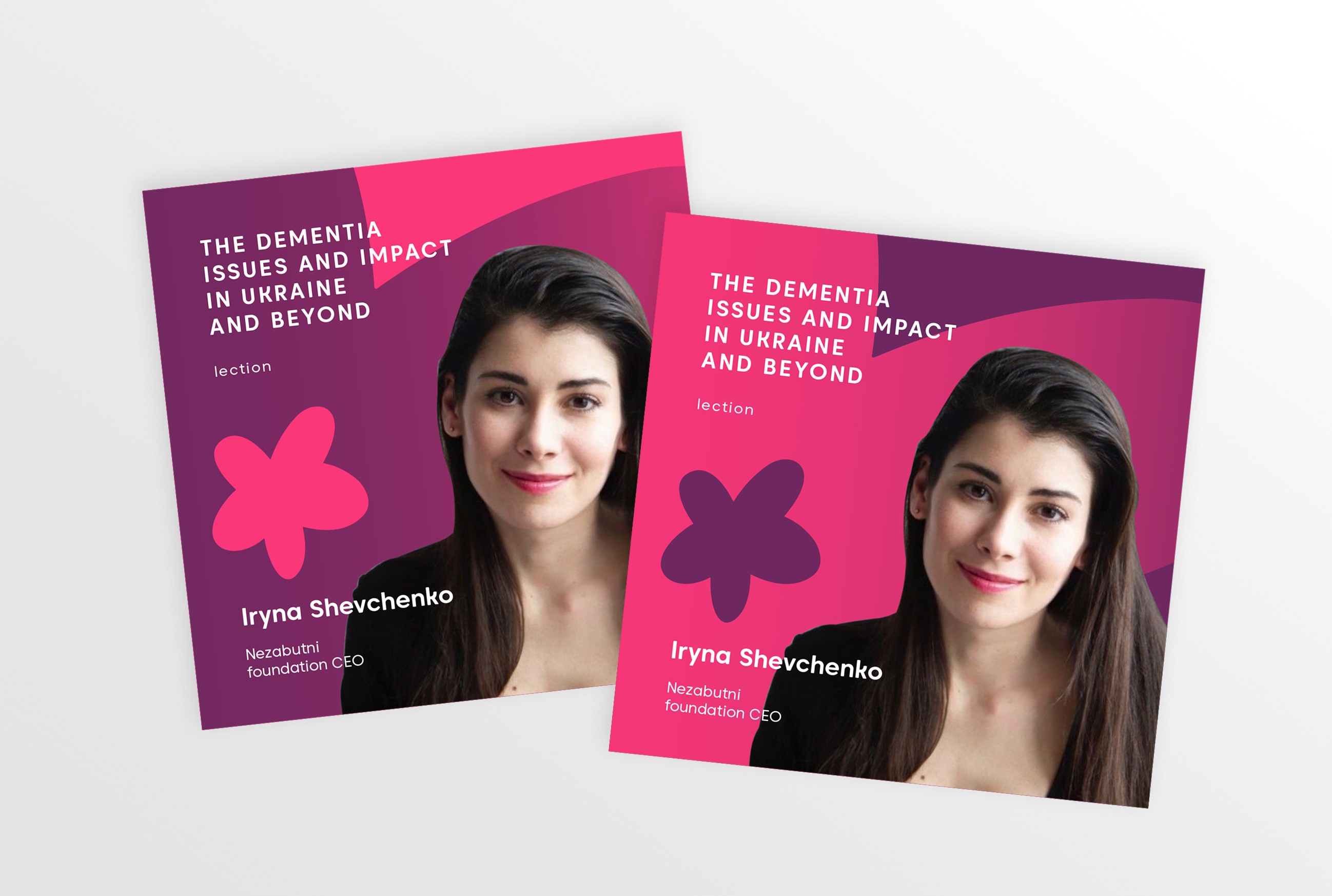
The final identity gives Nezabutni a flexible system for public communication, awareness campaigns, printed materials, social media, presentations, posters, merchandise, and digital touchpoints. The flower mark can work as a logo, a graphic element, a photo overlay, or a repeating visual motif across different formats.

Instead of relying on expected imagery like brains or hands, the identity creates a more memorable and hopeful language around memory, support, and visibility. The fading gradient adds emotional meaning: it reminds us that dementia should not be ignored, because people can quietly disappear from public attention if the topic stays unseen.

Create a free website with Framer, the website builder loved by startups, designers and agencies.